As more products were built, teams independently defined their own interface patterns and components. Without a shared system or governance model, inconsistencies increased and maintaining product quality became difficult.
How this problem felt for stakeholders
Patterns behaved differently per product task completion became unpredictable
Foundational decisions revisited each cycle - no shared definition of "correct"
Recurring problems solved from scratch -creativity spent on routine decisions
Through discussions with designers and engineers and a review of existing products, several patterns began to emerge about how teams were designing and building interfaces.

Img 1 : The same table pattern appeared across products but was implemented differently, highlighting the absence of shared components.
Img 2 : Without shared guardrails, stakeholder discussions repeatedly revisited foundational design decisions.
Teams were optimizing for different goals without shared guardrails.
Without a common design foundation, alignment depended on meetings and reviews. Foundational decisions were revisited repeatedly and consistency had to be enforced manually.
Stakeholder Goals
Engineering
Business
Designers
To understand the scale of the problem, I reviewed interfaces across multiple projects and mapped common UI patterns used in similar workflows.
Multiple versions of the same components living across codebases.
Inconsistent spacing and typography rules applied differently.
Accessibility gaps appearing across similar patterns.
Teams independently solving recurring problems in isolation.
No shared defaults to guide implementation choices.
Design decisions too siloed to be reused effectively.
Img 3 : Audit revealed that common UI patterns — buttons, inputs, and cards — were implemented differently across products.
The real problem wasn’t visual inconsistency — it was fragmented decision-making across teams.
Designing the system was the easier half. Convincing teams to change how they worked was harder.
Repositioned the design system as reliability infrastructure, not a design tool. Their language, their concern.
Dropped the token/component vocabulary entirely, led with rework cost and handoff contracts. Made the ROI tangible.
Reframed constraints as creative leverage — system absorbs routine, freeing thinking for complexity
Before designing anything, I studied how mature systems handle this at scale — IBM Carbon, Material Design, Atlassian. Not to copy them, but to understand the structural logic behind their decisions.

Img 4 : Insights from mature design systems helped identify key factors

Img 5 : Atomic Design provided a clear structure for organizing the system
" It gave me a clear structural blueprint for the system — one that balanced flexibility with consistency and made decision-making predictable across projects."
Based on insights from mature systems and stakeholder needs, I structured the solution as a layered system teams could adopt incrementally — starting with foundations, then expanding into components and page structures.
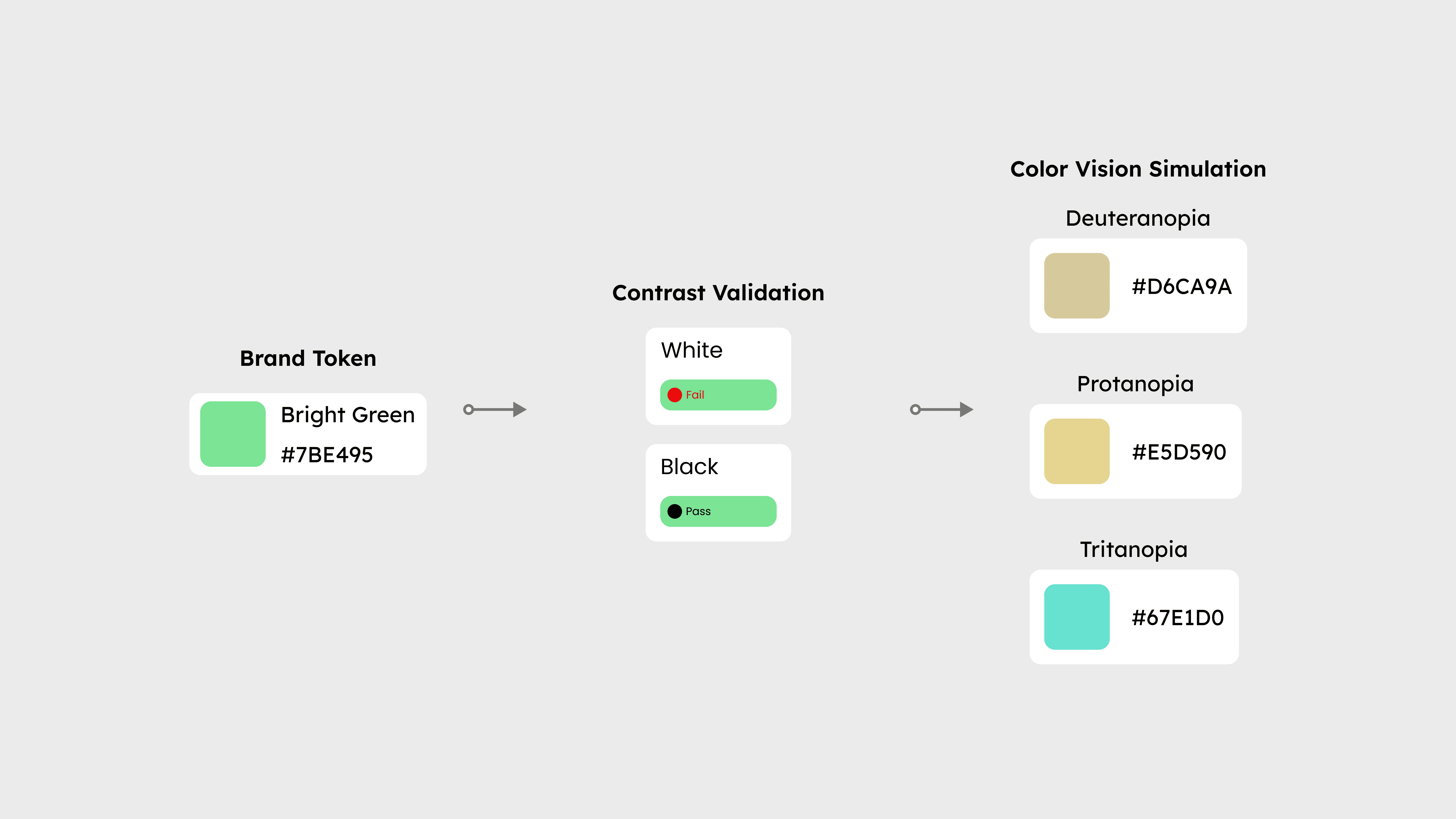
Img 6 : Color selection wasn't subjective — every token had to pass contrast and color blindness checks before it entered the system.
Consistency needed to start with shared primitives. Tokens defined spacing, typography, and color so products inherited the same rules by default. Examples included:
Grid rules
Type system
Color tokens
Spacing scale
Iconography
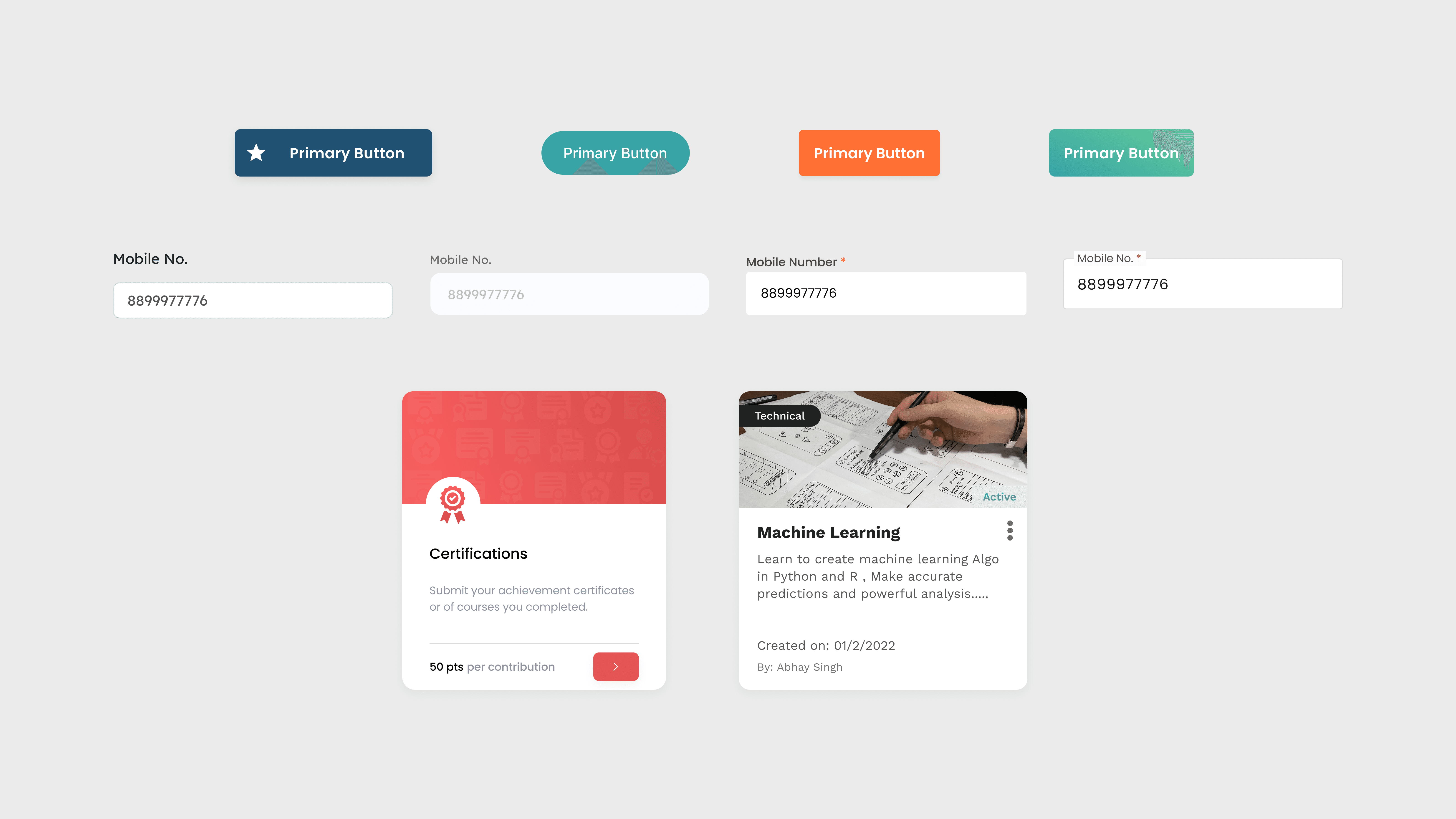
Reusable components translated those foundational rules into predictable UI building blocks. Common component patterns included:
Buttons
Input Field
Cards
Toasters
Popups
Tables
Navigation
& More


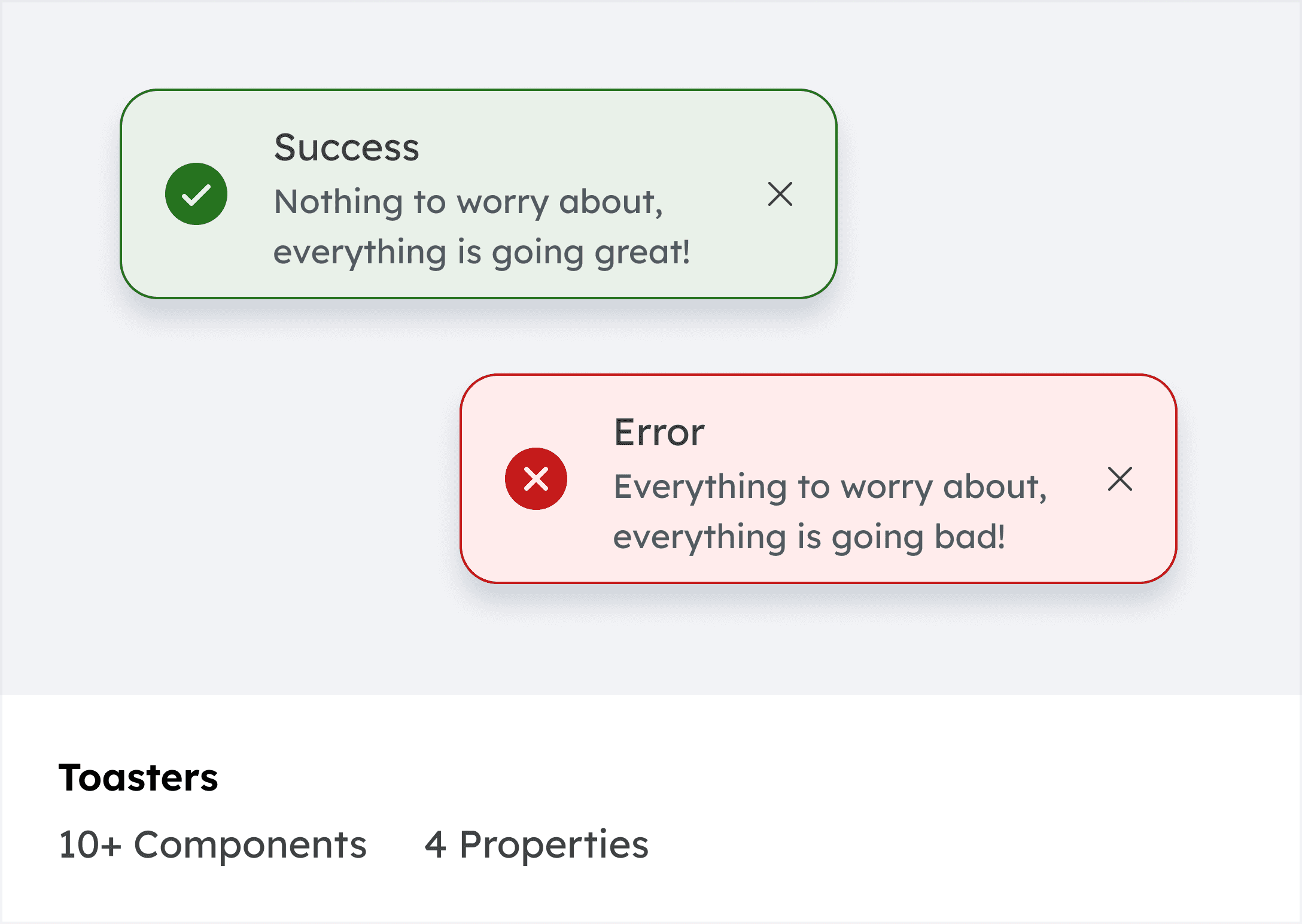
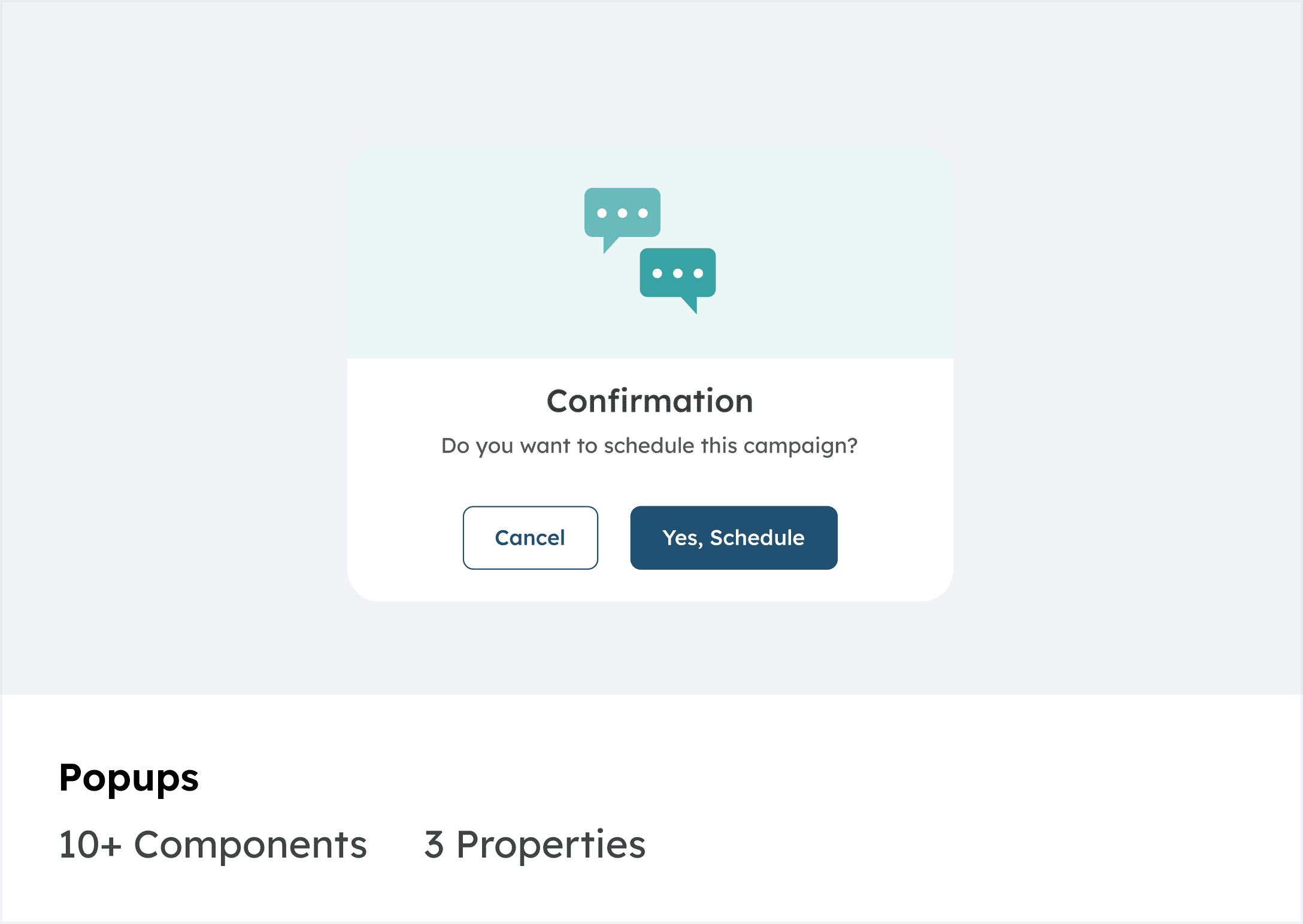
Img 7 : Reusable components translated design rules into predictable UI building blocks across products.

Img 8 : Design system documentation showing primary color tokens and usage guidelines.
Adoption required more than components. Clear documentation ensured teams understood when and how to use them. Documentation covered:
Usage Guidines
Do/Don'ts
Edge Cases
Development References
After introducing shared foundations, reusable components, and documentation, teams no longer had to redefine UI decisions for every feature. The system reduced repeated discussions and allowed teams to move faster with consistent patterns.
Img 9 : Introducing shared components and patterns replaced ad-hoc UI implementations, enabling consistent interfaces across products.
Clear documentation and shared patterns allowed teams to reuse decisions instead of redefining them in every project.
Getting teams to change how they work takes the same skills as UX — reduce friction, make the right path the easy path.
Documentation is the product
A component that exists but isn't understood isn't a resource. It's confusion.
Start with new, not old
Asking teams to migrate creates resistance. Giving them a strong starting point creates advocates.
Know your audience
Architects and engineers needed a different frame than designers — same work, different language.