How I transformed a fragmented UI ecosystem into a unified , high speed design system.

THE PROBLEM
Why we need a design system?
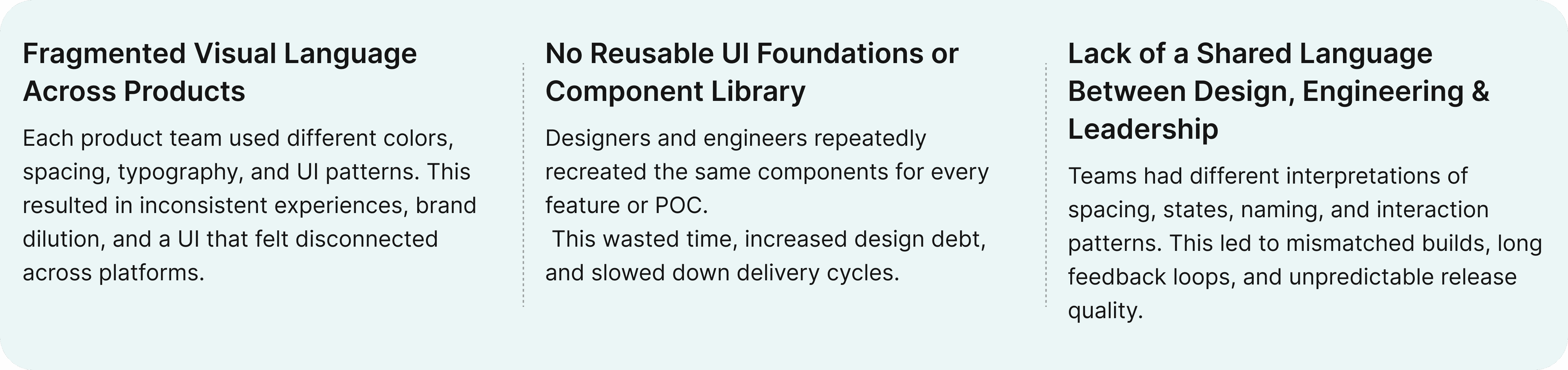
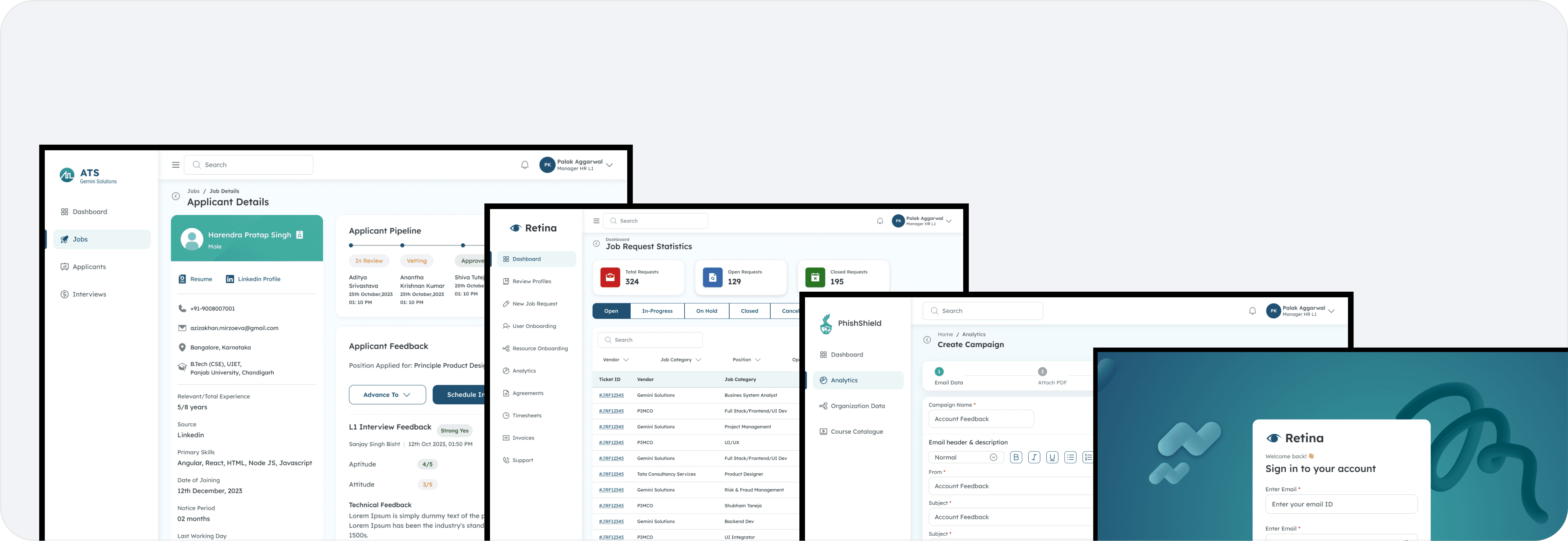
When I joined the team, there was no unified design foundation across any of the products.
Each team had evolved its own version of spacing, colors, typography, and UI patterns — resulting in fragmented experiences and slow delivery cycles. Designers often rebuilt the same components repeatedly, while developers relied on inconsistent specs or outdated handoffs.
This created a cycle where design inconsistency → development rework → slower releases → more inconsistency.
There was no shared language, no reusable system, and no reliable way to keep quality consistent across teams.
To ship faster and scale confidently, we needed a design system that brought order, predictability, and clarity to the entire product ecosystem.
50+ Unique colors
Aa
Aa
Aa
Aa
Aa
Inconsistent typography
Broken spacing system
No Components ❖
No component and pattern library
INITIAL DISCUSSION
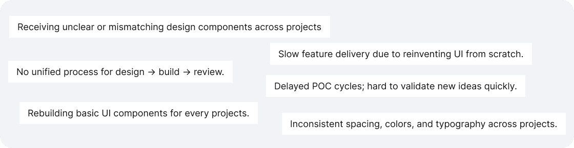
Talking to stakeholders
I spent time speaking with the people who were directly impacted by design inconsistency — designers, developers, PMs, and team leads.
The goal was simple: understand how each team worked, where friction existed, and what they needed from a design system.
Through these conversations, several themes emerged:
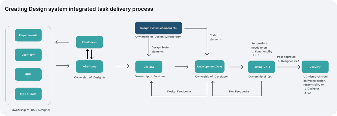
PROCESS SETUP
Creating a predictable, scalable design workflow
Building a design system wasn’t just a design task — it was a strategic initiative to bring clarity, consistency, and scalability across our entire product ecosystem. This meant defining our design principles, establishing a unified design language, creating usage guidelines, and building a system that could be implemented, adopted, and evolved over time.
UI AUDIT & PATTERN REVIEW
What did we do?
Before defining the system, I conducted a comprehensive audit of our existing products to understand the real scale of inconsistency and uncover the patterns we needed to standardize.
Activities we did here
Audited all existing products to map inconsistencies in colors, typography, spacing, components, and patterns.
Reviewed every component instance across screens to understand how and where variations were used.

STEP ONE
Design Research
Before defining the foundations or building components, we conducted focused research to understand how successful design systems are structured and what our own ecosystem needed to support.
Activities we did here
Before defining the foundations or building components, we conducted focused research to understand how successful design systems are structured and what our own ecosystem needed to support.
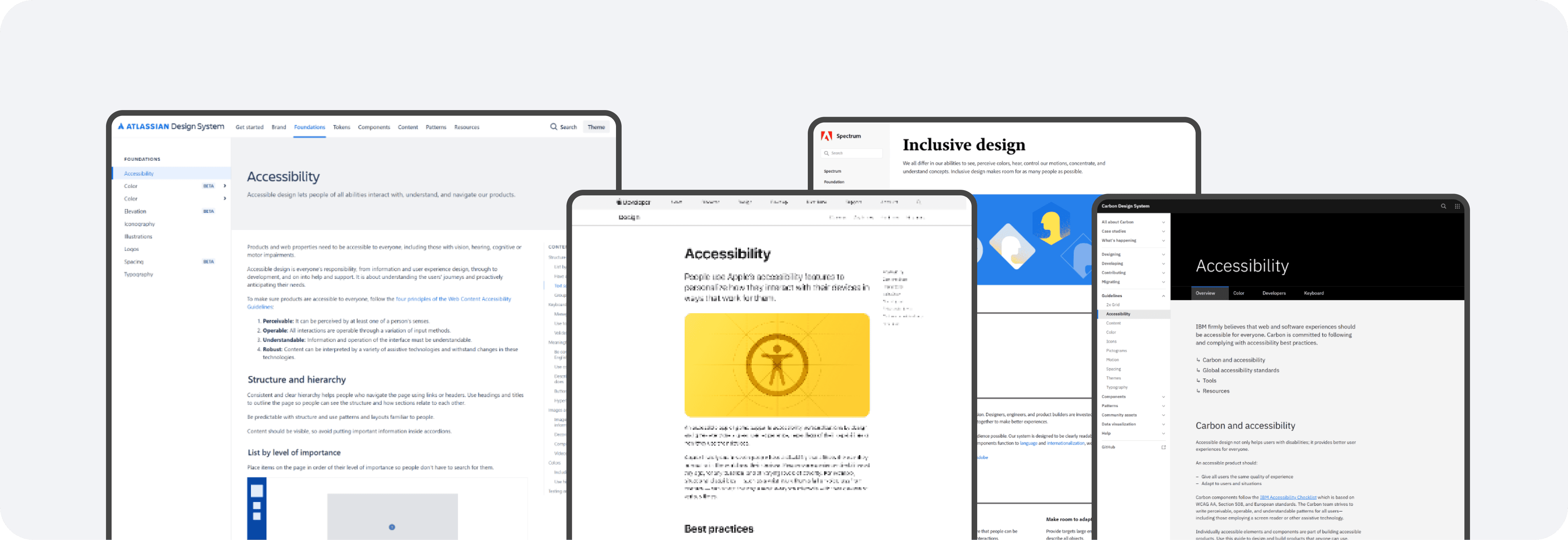
Reviewed accessibility guidelines to ensure the system met WCAG standards from the start.
PHILOSPHY
Design Approach

STEP TWO
Foundations (ATOMS)
I started by establishing the foundational elements of the system—spacing, typography, and color—which created a scalable, semantic structure for every component that followed.
Typography
Typography plays a crucial role in establishing hierarchy and readability, so I selected a variable typeface that performs well across platforms, adapts responsively, and offers the flexibility needed to support diverse content and accessibility needs.


Color System
We created a unified, accessible color palette designed to enhance clarity, consistency, and usability across all web products.


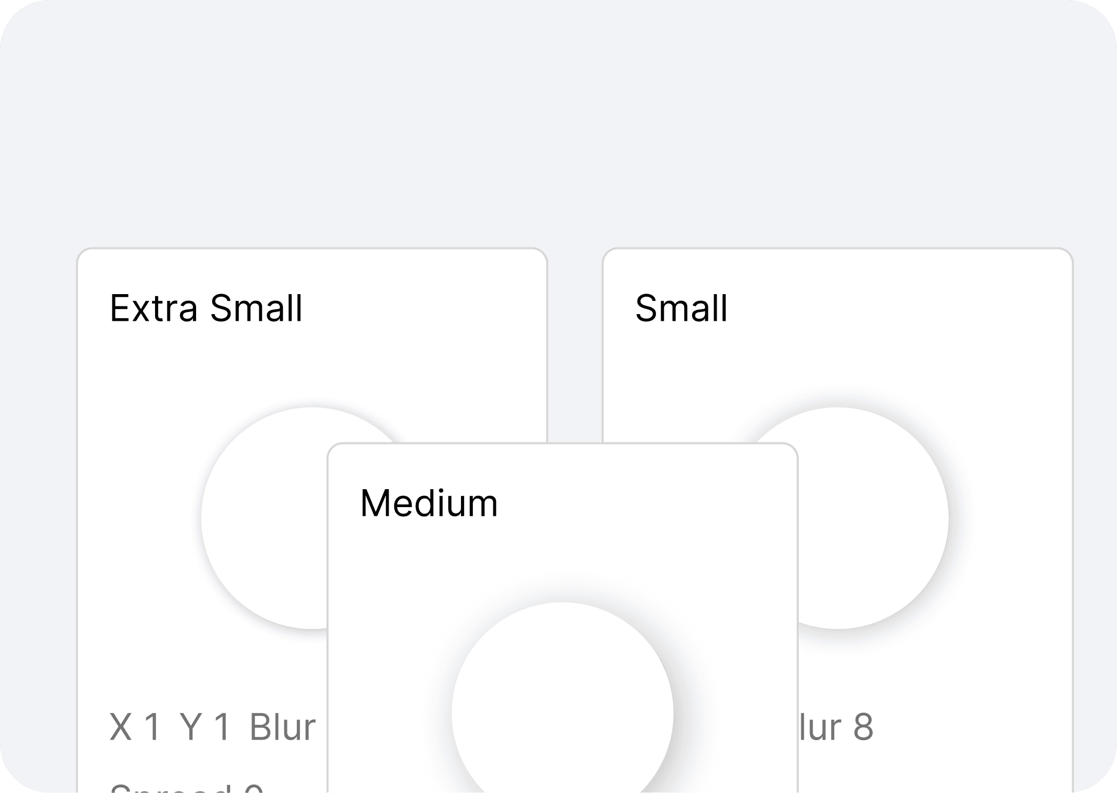
Elevation, Spacing & Sizing
To maintain structural consistency across layouts, we standardized our spacing and sizing system on a 4px grid scale. This created predictable rhythms in our UI, simplified alignment decisions, and reduced visual noise across products.
Iconography
To maintain visual consistency and reduce the effort of creating icons from scratch, we adopted the Phosphor Icon Library as the primary icon set for our system. Its flexible, geometric style aligned well with our visual language and worked seamlessly across various product touchpoints.

STEP THREE
Basic Components (MOLECULES)
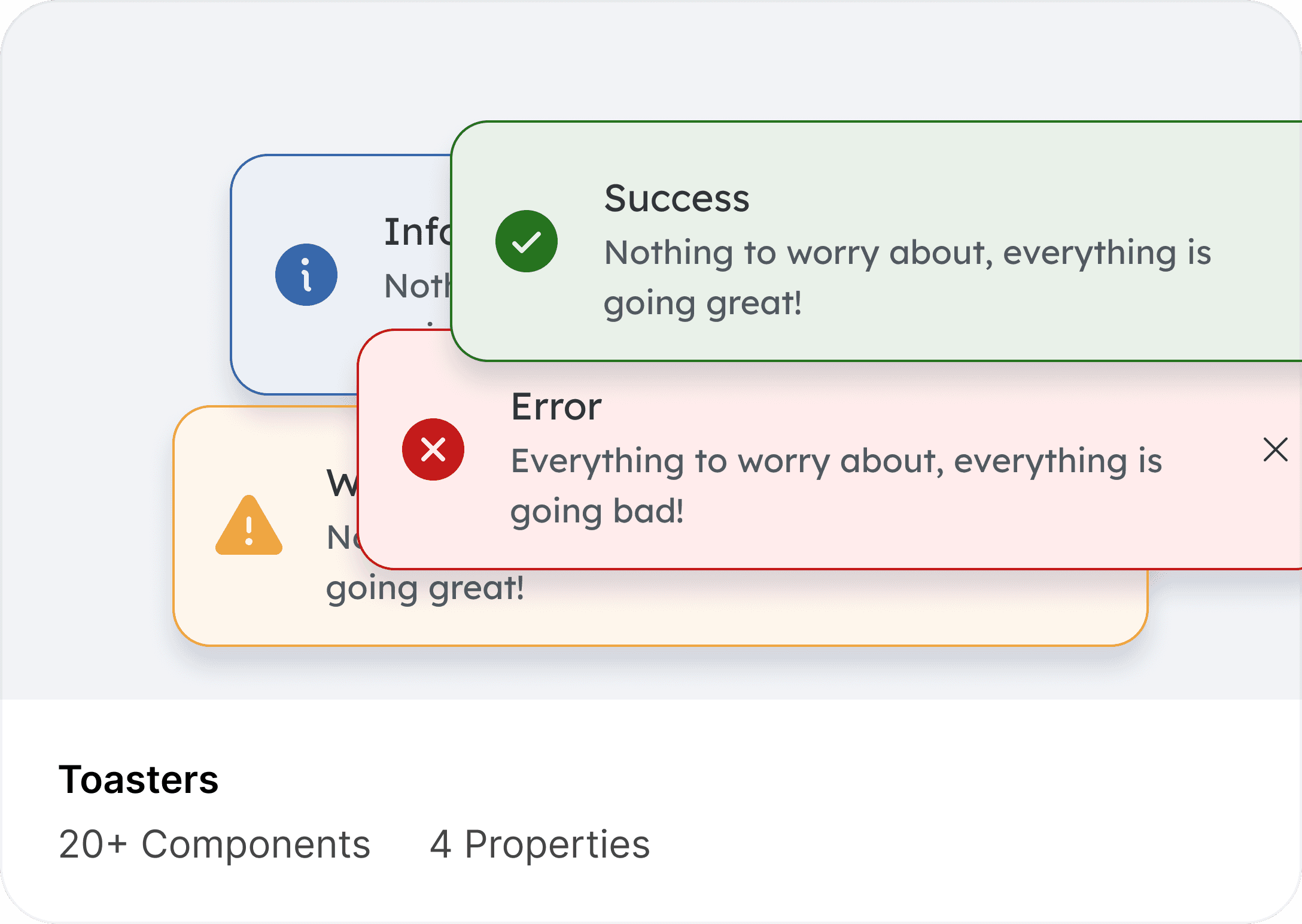
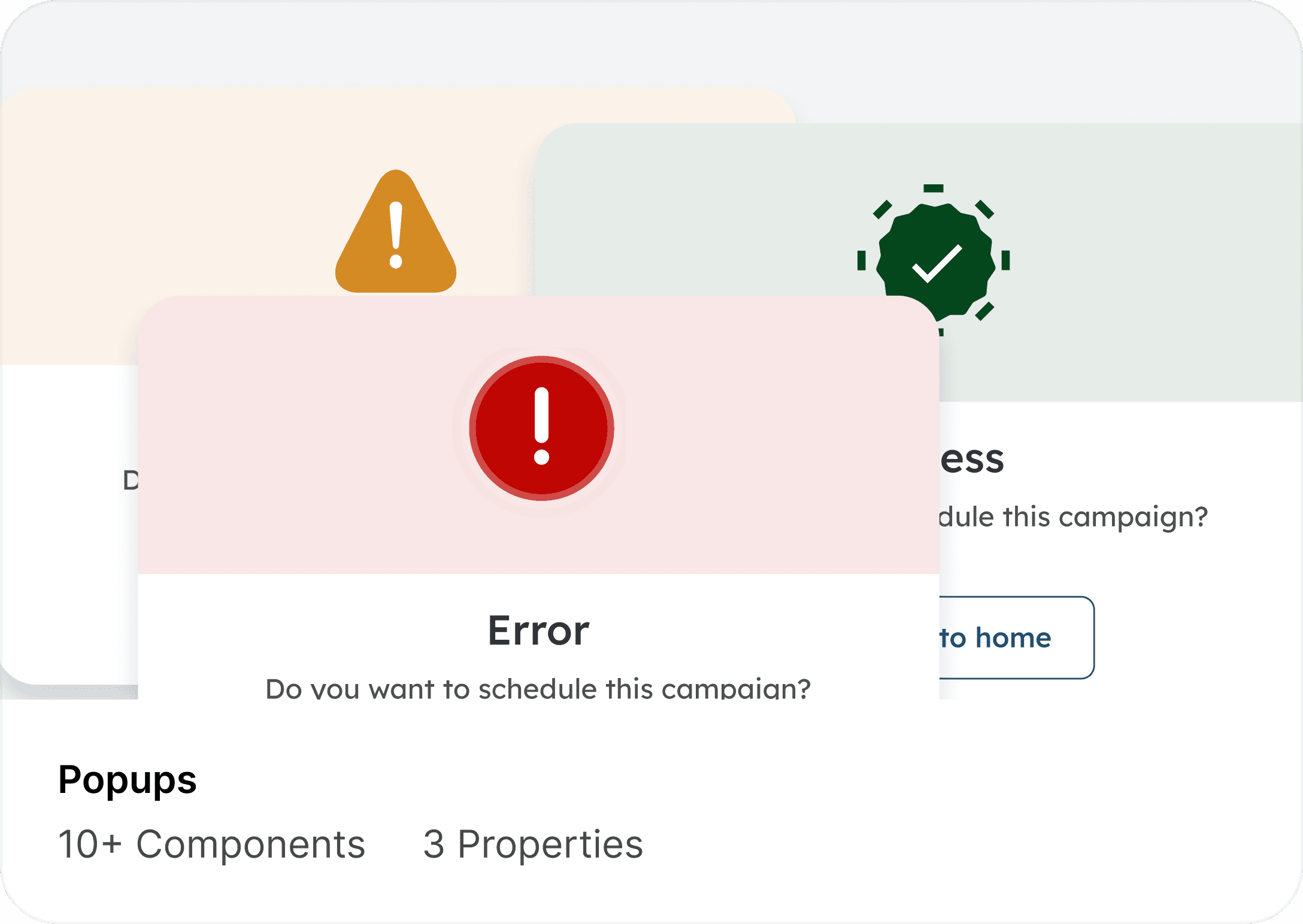
To complete the visual language and ensure the system was ready for real product workflows, I expanded the design system with a full library of essential components—buttons, inputs, dropdowns, date pickers—as well as more advanced patterns like modals, checkboxes, radio groups, data tables, pagination, and filtering controls.


STEP FOUR
Design Documentation
Documenting components and the decisions behind them was a core part.
Every component is supported with clear guidelines that outline its behavior, interaction states, and recommended usage. This ensures that designers and developers understand not just what to use, but why and how it should be used across different contexts.

CONCLUSION
Results, Learning & What’s Next
The introduction of the Gemini Design System significantly strengthened collaboration between design and engineering.
By creating a unified library of tokens, components, and guidelines, teams could design and build with far greater speed, accuracy, and consistency
Key Learnings
Start Small, Scale Smart:
Building scalable systems begins with a solid foundation. Starting with tokens and core patterns made everything else easier to extend.
Documentation is Design
Writing clear guidelines, usage rules, and Do’s & Don’ts was just as important as designing components. It ensured the system was understandable and adoptable.
Collaboration Over Control
The system succeeded because designers, developers, and product teams contributed to it. Shared ownership created better alignment and higher adoption.
Iteration is Continuous
A design system is never “done.” Every round of feedback refined the components, guidelines, and documentation.
Explore More Case Studies
Smarter Basketball Training with AI
An AI-powered app that analyzes shooting technique using wearables. Bridging coaching with real-time feedback to boost accuracy and confidence.

Redefining Movie Booking
A seamless platform for discovering and booking movies. Designed to simplify ticketing, seat selection, and payments in one flow.
